F1 VR Experience
Immersive Data Visualization·7 min read
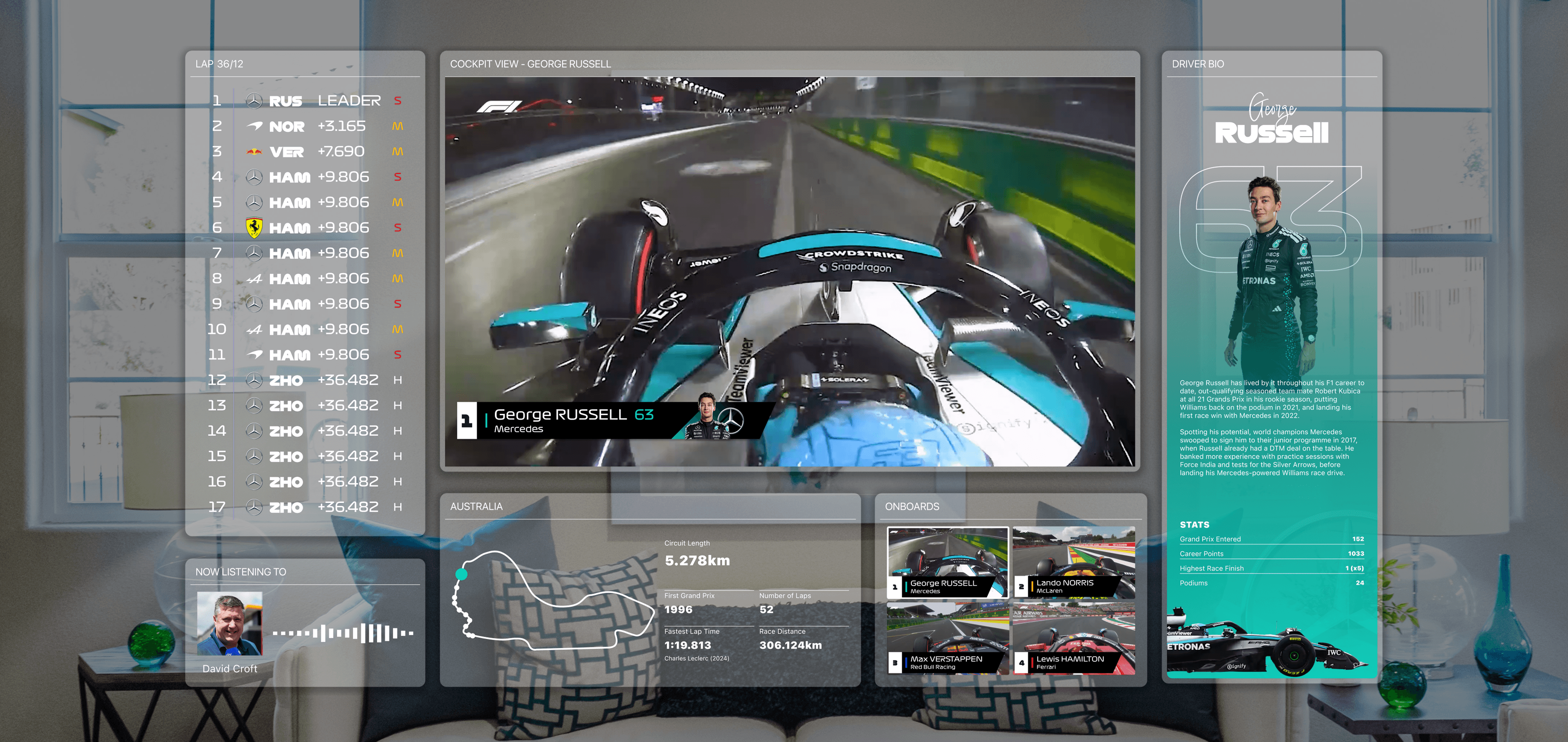
Formula 1 fans already juggle a broadcast, onboard cameras, radio, and a leaderboard. None of that was designed for a headset. I designed a VR viewing system that treats the race like a HUD, not a TV dragged into 3D.
An unaffiliated concept project. Formula 1, team, and driver marks belong to their owners and are used here to illustrate a design exploration.
Role
UX/UI Designer
Timeline
Fall 2026, 4 weeks
Type
Directed Studio (Senior Project)
Tools
Figma, ShapesXR, Meta Quest 3S, Cursor
Background
Formula 1 already produces more live information than a rectangle can hold. The way people watch it has barely moved.
Problem
During a race, a fan stitches a broadcast, cameras, radio, and a leaderboard by hand, and the director still chooses the picture.
Solution
Keep the live stream fixed as a spatial anchor, then place cameras, standings, and driver info in reusable zones around it.
Outcome
A modular viewing system that stays readable across a two-hour Grand Prix, checked with fans on a Quest.
Problem
Why This Project?
This started from a gap in how the sport is watched. Formula 1 already produces more live information than a rectangle can hold, and there is still no native way to watch it in a headset.
During a Grand Prix a fan already lives inside:
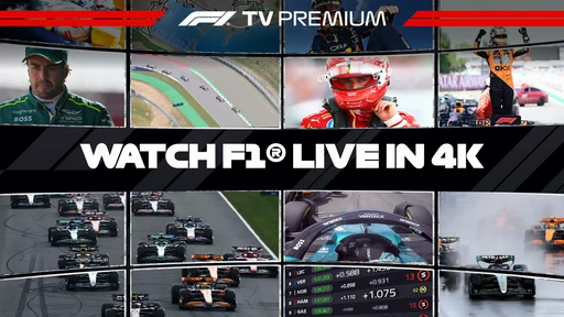
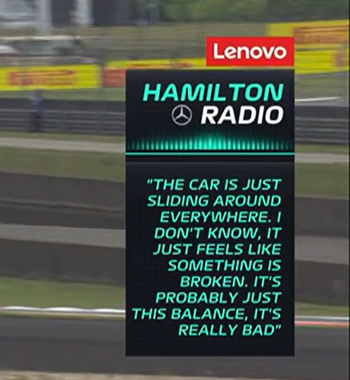
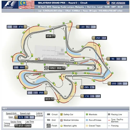
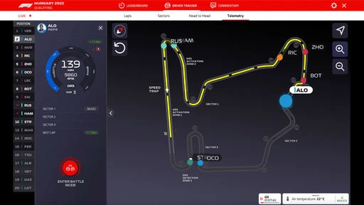
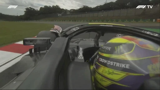
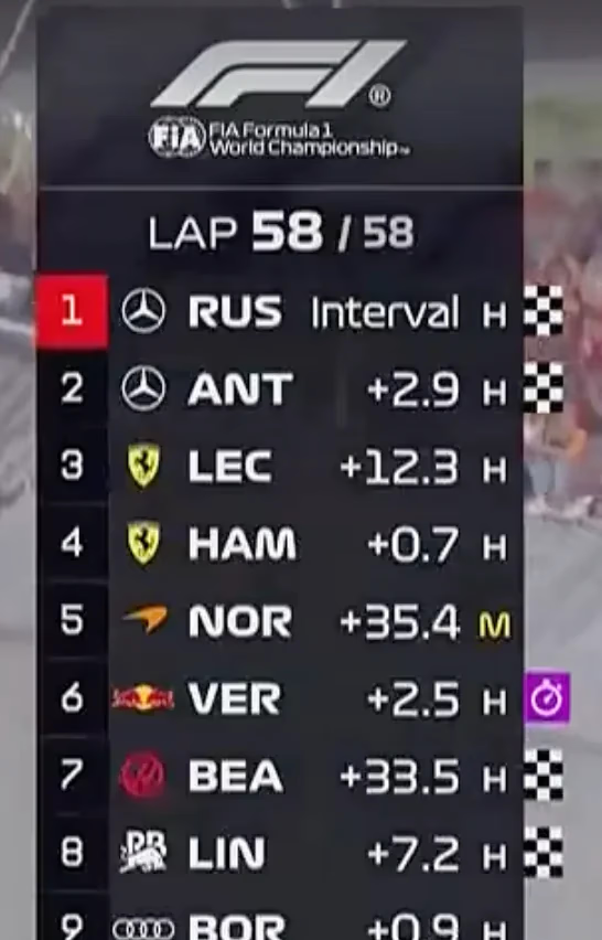
All of it lands on a rectangle someone else is cutting. There is no native Formula 1 experience for a headset. If you want the race in VR today, you are mirroring a desktop or sitting in a virtual cinema — a TV picture with none of the spatial advantages the hardware actually has.
Opportunity
The data already exists. Fans are already doing the work of stitching a race together. The opening was to stop asking a television to hold all of it.
What if Formula 1 viewing was designed for the space around you, not for a television that happens to be in a headset?
That question is about attention before it is about visuals: where it lives, what is allowed to move, and how much of the body the interface is allowed to spend.
Research
Hardcore Formula 1 fans already know how to watch a race. What they do not know is how a two-hour Grand Prix feels in a headset: neck, battery, attention, and the second the car leaves the middle of the view.
I wrote the brief before I drew the layout. Success meant lasting the race, finding the board, and still watching the car.
Comfort
A viewer can last a full Grand Prix without steering to keep up.
Findability
Standings, cameras, and radio are where you left them, every lap.
Attention
The stream never loses the middle. Supporting information knows it is supporting.
References
I did not invent spatial rules for this project. I translated three sources into a Formula 1 viewing problem.
- Designing for visionOS
A stable spatial anchor, windows that recede instead of competing, and a field of view you design for instead of filling.
- Meta Horizon: Design immersive experiences
Comfort over spectacle, sessions you can actually finish, and interactions that do not ask the body to do the interface's job.
- Accessibility and UX Design: Building Inclusive User Experiences
If you have to hunt for the thing you came for, the experience is already excluding people. Clarity is an accessibility decision.
Solution
Core Concept
Recreating a television inside VR would have been the obvious move. It would also have ignored the platform.
I treated the experience the way a racing game treats a HUD. The broadcast stays in charge. Everything else is spatial: reachable, ranked, and allowed to recede.
The platform augments the stream. It does not replace it.
From a seated position, without leaving the broadcast, a fan can:
- 01Watch the race
- 02Monitor standings
- 03Switch onboard cameras
- 04Access driver information
- 05Follow race events
The system is how those jobs stay in reach from a seated view.
Design Evolution
Constraints
Quest-class headsets were the honest test: largest consumer install base, limited battery, and a field of view that punishes anything you have to hunt for. I treated those as the design strategy from the start.
01
Long viewing sessions
A race regularly runs two to three hours. The layout has to survive the whole thing, not the first lap.
02
Battery life
Consumer headsets do not last a Grand Prix. Every extra turn of the head is energy you do not have.
03
Motion comfort
If you have to steer to read the standings, you will stop reading the standings.
04
Live data
Telemetry, cameras, and race control keep moving. The interface cannot freeze while the race does not.
Design for the race, not the demo
I designed for Meta Quest-class headsets because that is what people actually own. If the layout only works for a thirty-second demo, it is not a viewing system.
Two hours in a headset only works if you barely have to look around.
Iterations
I started on paper: who the layout was for, what a fan reaches for during a stint, and how a window should behave once you can put it anywhere. That sketch is the system in miniature. A fixed center, modular sides, and a rule that content can move without the layout moving.
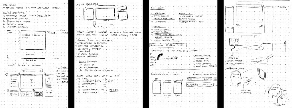
From paper I took three visual directions to screen. Familiar F1 color and type helped people recognize the sport. Unchecked, they also fought the stream for attention.
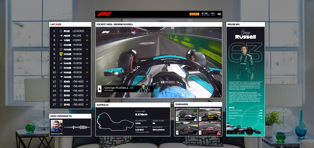
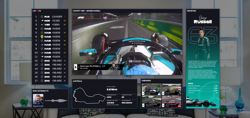
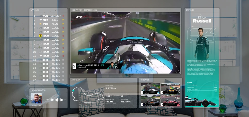
- Familiar
- Brand aligned
- Dense
- Visually noisy
The Turn
Three looks in, some of the work was trying to win a beauty contest. A livery is not an interface, and a headset is not a more expensive television.
Keep the stream in charge, quiet everything else down, and borrow from racing HUDs instead of television chrome.
The window itself went through the same pass. Early chrome was louder than the content. The version that shipped is a quieter shell: one anatomy, reused across every module.
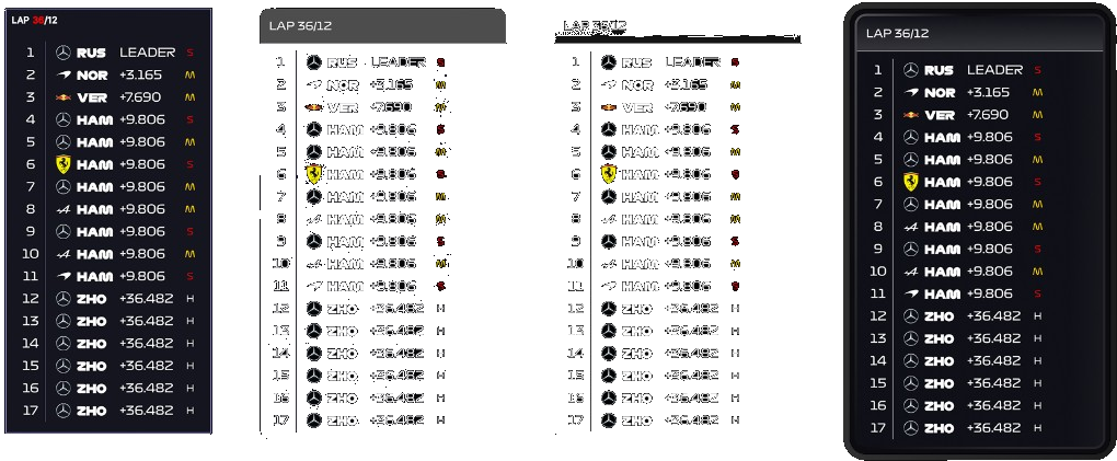
The hybrid that shipped kept the identity, borrowed the logic of a racing HUD, and followed the rules of spatial computing: one anchor, quieter chrome, supporting information that knows it is supporting.
Spatial System
Decision
Spatial zones
Race information competes for attention.
The interface is divided into three spatial zones, left, middle, and right, and each one serves a distinct purpose.
Users spend less time searching for information and more time watching the race.
A layout that can take a new module without a new frame needs a vocabulary first. Zones decide where things may land. Windows are the shells. Components are the content. Those three stay independent so a new module does not force a new layout.
Left
Leaderboard and team radio
Middle
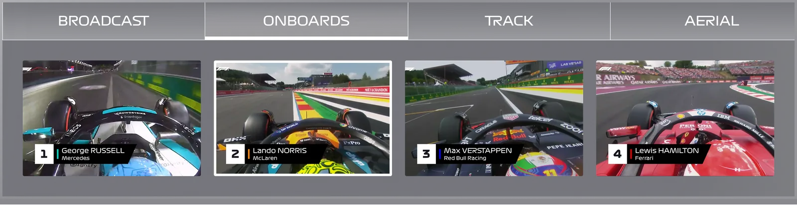
Race stream and camera browser
Right
Driver and team information
Three fixed areas in the viewer's field of view. A zone never holds content itself. It decides where a window is allowed to land, which is how the layout stays predictable for two hours and how the viewer's body stays out of the interface.
Decision
Fixed central stream
Users should never lose the race.
The live broadcast stays anchored in the middle zone and never moves.
- Reduces head steering
- Creates a consistent focal point
- Mimics familiar television behavior
- Improves comfort during long sessions
Users can glance at supporting information and immediately return to the race.
Final Design
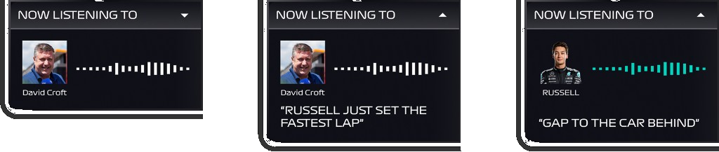
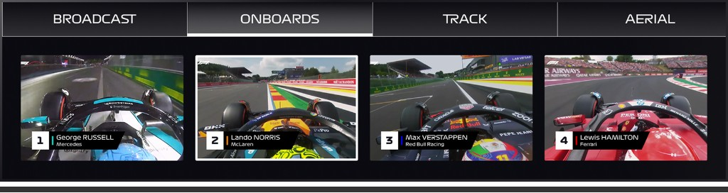
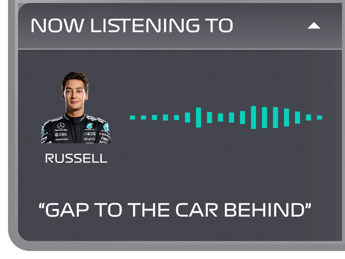
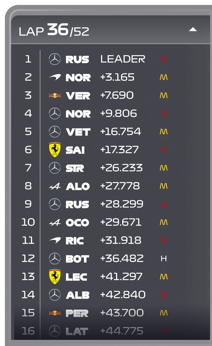
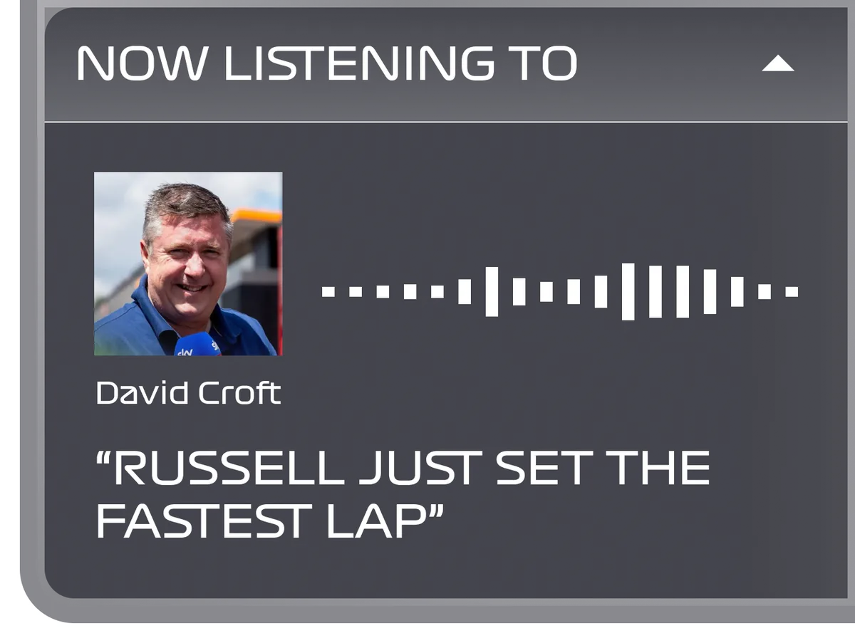
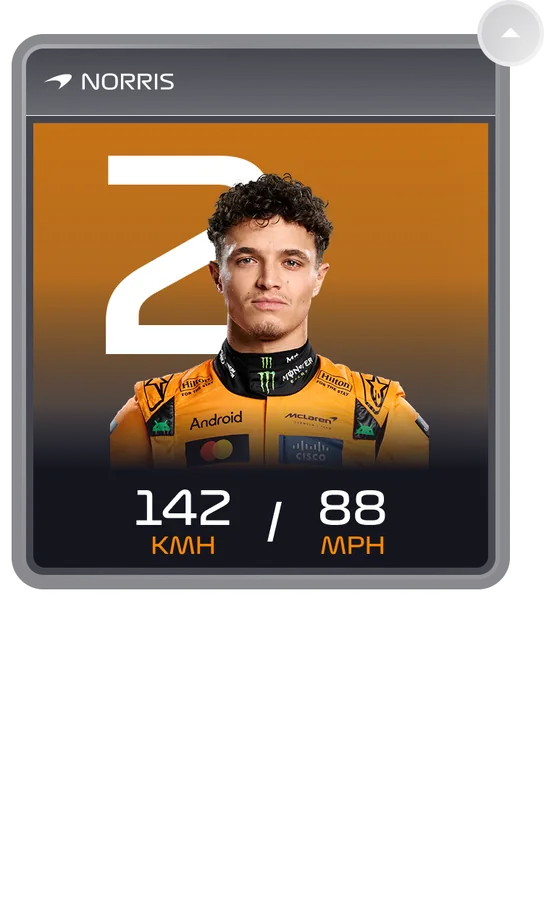
Each module is a job a fan already does during a stint: watch the race, check the board, switch an onboard, read a driver, listen to radio. Support sits further out on purpose. Race-control notifications and a world-anchored track map can interrupt you without rearranging the layout you already learned.
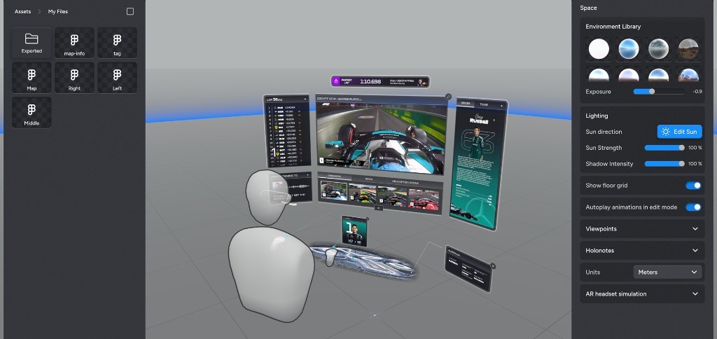
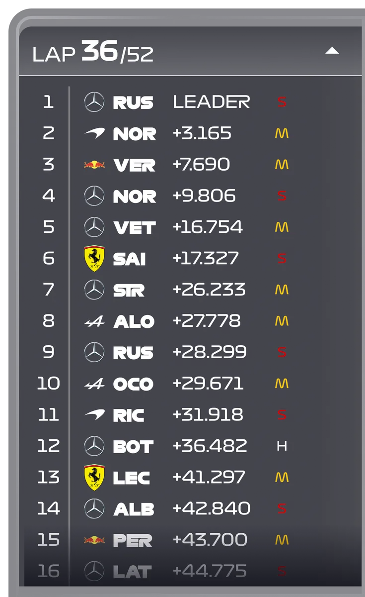
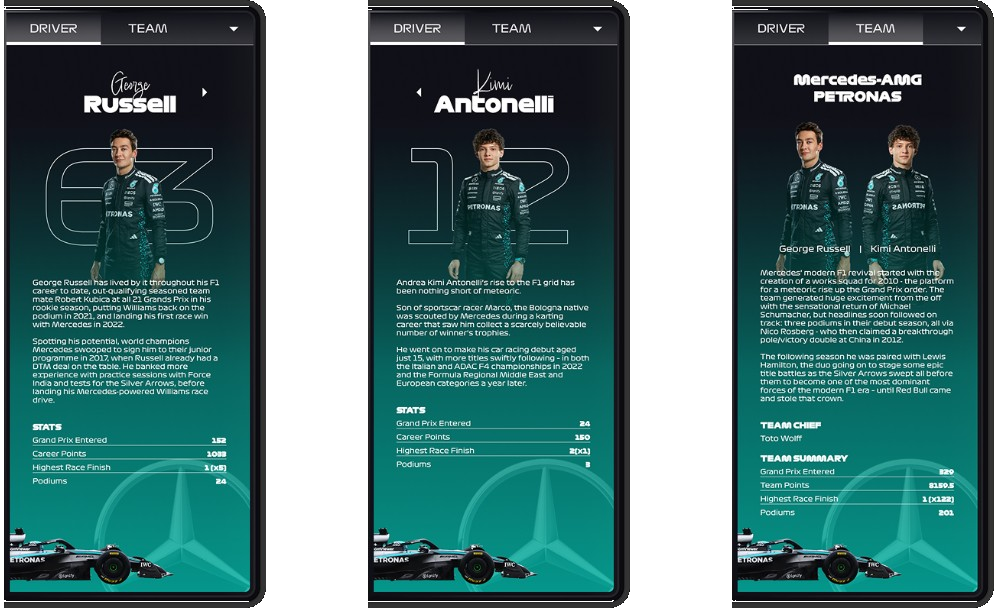
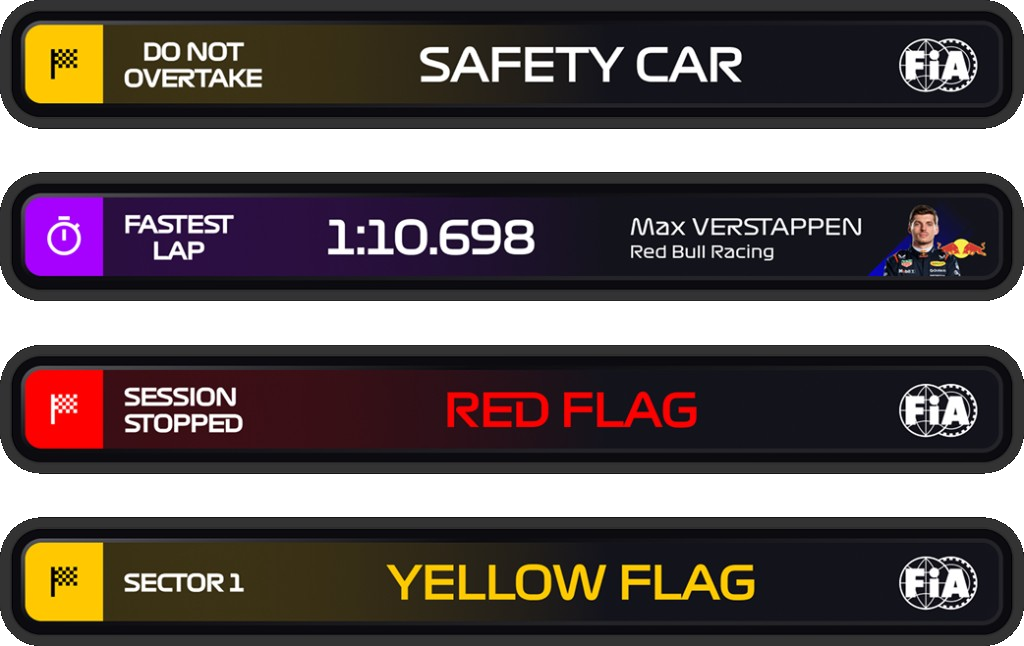
Standings live in the left zone for the whole race. Position, gap, and compound stay readable at a glance, because the component never has to invent a new place to sit.
Most of the class did not own a headset. I built the same spatial model as a working prototype so they could collapse a panel, switch a camera, and fire a flag instead of watching a recording of me doing it.
Validation
I put the concept on a Quest with people who already watch Formula 1. The questions were the ones I had written down as success: could they stay comfortable, could they find things without hunting, and did they still watch the race.
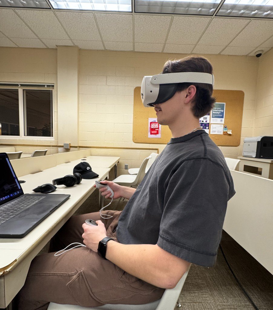
From the headset
The note that kept coming back:
“Don't make me look for the race.”
Key Findings
Finding 1
They wanted the race stream locked. Once it drifted, they stopped watching and started hunting.
Finding 2
Peripheral panels only worked if they stayed secondary. Equal weight meant equal noise.
Finding 3
A layout that did not reshuffle itself was easier to live in for two hours.


Reflection
Spatial Design Is Not Floating Screens
The work is not placing windows in 3D. It is hierarchy, a place for everything to live, and a session you can survive. Every interface decision had to take something off the viewer's body: less turning, less searching, less deciding where to look.
Design for the length of a session, not the first thirty seconds. Build a system you can add a module to, not a one-off overlay. Translate a platform instead of copying a screen. Prototype the interaction, then test it with the people who already know the job. Keep the race in front of you, and the data around you, and spatial computing starts to feel like watching, not operating software.