World Geography Interactive
Web Application Design·6 min read
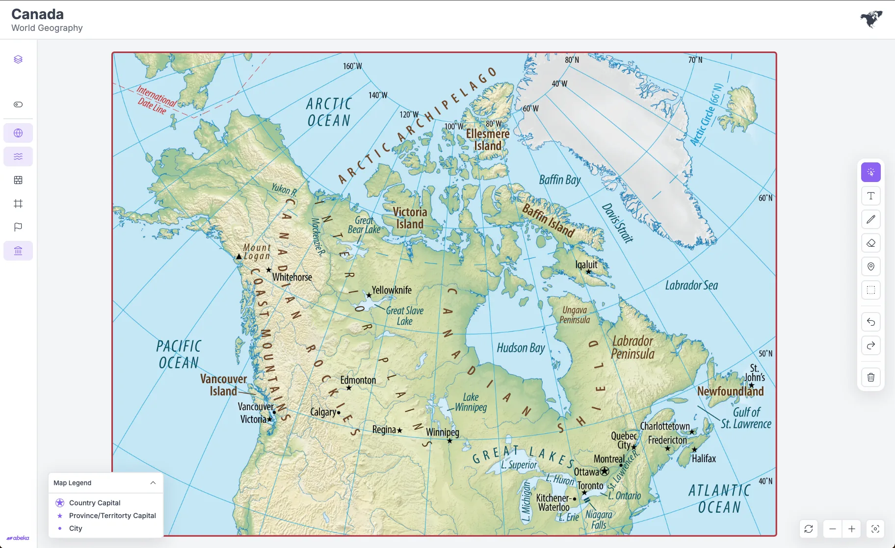
Teachers needed a digital companion for a new World Geography curriculum, but lessons still depended on separate physical maps they could not combine. I designed and built a system that layers those maps in the browser, lets teachers mark them up live, and cut production time in half.
Role
Lead UX/UI Designer, Front-End Developer
Timeline
2 years
Type
Web-Based Educational Interactive
Tools
Figma, Cursor
Background
Abeka's History, English, and Social Studies team needed a digital companion for a new World Geography curriculum.
Problem
A typical lesson meant stacking political, physical, and border maps on a desk, and never seeing them at once.
Solution
Layer those exact curriculum maps in the browser, then give teachers a small set of tools to mark them up live.
Outcome
Map production dropped by half, interactive setup by 85%, and teachers asked for it in every lesson.
Problem
Why Build It?
The project started when Abeka's History, English, and Social Studies team brought a new World Geography curriculum and asked for a digital companion.
I owned the UX/UI and the front-end. Two teammates helped stand up the first layered-map MVP. A year-long pause — the third-party maps failed curriculum review — sat in the middle of the timeline. When work resumed, I designed and built the classroom tools and the internal builder myself.
The temptation was spectacle. The job was a class period.
They imagined:
- Interactive globes
- Real-time geographic data
- Complete teacher control
- Highly immersive experiences
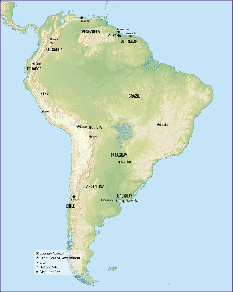
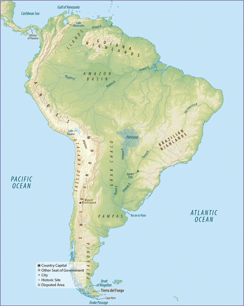
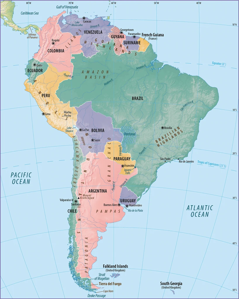
Meanwhile, teachers were already stuck. A geography period meant a pile of paper maps: political, physical, borders, latitude and longitude. They could swap them, but they could not stack them. Whatever the last map had shown disappeared the moment the next one went up. The interaction they needed was to keep the map and shuffle what sits on top.
Opportunity
In conversation after conversation, teachers said the same thing in different words.
Give us the ability to mix and match information based on the lesson we're teaching.
A few even sketched it as transparent overlays: keep the map, shuffle what sits on top. That was the opening — a stack teachers already knew how to teach from, rebuilt as a system.
Research
Classroom Workflows
Geography class is physical. I grew up watching my mom teach, so I already had a feel for the rhythm of a lesson. To check that against this building, I sat with teachers and collected the activities they actually ran, not the ones in the product brief.
The notes looked messy at first. The same kinds of tasks kept showing up, and the brief shifted from a globe to a system teachers could run a period with.
Have students identify major features
Use the unlabeled map for quizzes where students come up and annotate features
Discuss how geography influences where people live and build cities
Compare physical map with political map to see how borders sometimes follow natural features
Annotate or trace major features
Have students color-code different elevation zones or climate regions
Create scavenger hunts where students race to locate specific features, countries, etc
Mark the locations where major people groups established
Have students take turns marking features while explaining what they know
Start with blank map, each student adds one label until it's complete
Draw circles around features and compare sizes
Show unlabeled, student makes prediction by marking with a star, then reveal labeled to check
Call out a feature, student must touch/mark the correct location
Student draws arrows, symbols, or shapes to help class guess a feature without words
Students place dots where they think major cities might be located based on geography
Students draw a route across Africa, must explain how terrain affects their journey
Draw/place icons showing where different animals live based on terrain
Mark areas vulnerable to drought, flooding, etc., based on physical features
Synthesis
Those activities weren't random. They kept falling into the same four jobs, which is what let me design a small set of tools instead of a feature for every request.
Feature Identification
Find the river, the mountain, the city, then keep it on screen while the conversation moves.
Geography & Human Activity
Show why a civilization settled here, which means terrain and borders in the same view.
Mapping Exercises
Compare regions against each other, not just name them in isolation.
Classroom Collaboration
Mark the map together so the whole class is looking at the same decision.
Key Insight
Teachers weren't asking for more map. They were asking to rearrange the one they already had.
Design Evolution
Phase 1: Defining the MVP
I started with two teammates, asking for the smallest thing we could ship that still served the new curriculum. Layered maps got us there technically.
In class, though, teachers could look. They still couldn't teach — no drawing, no pinning, no way to run the activity on the map itself.
Pause
Then the third-party maps failed a curriculum review, and work stopped for about a year.
When it came back I was the only designer, so I also owned what it should become: tools a teacher could run a period with, and a system a team could still update next year.
Phase 2: Designing for the Classroom
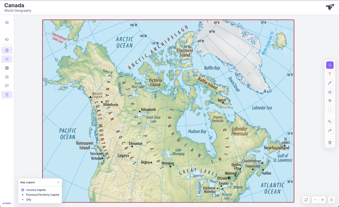
I stopped designing a map product and started designing for a class period. Teachers needed the layers, yes, but they needed a pen, a pin, and a way to build an exercise without leaving the map.
Navigation got quieter, the layout left room for those tools, and the interface started to feel like something you would actually project on a classroom wall.
Visual Refinements
Simplified Navigation
Controls that used to compete for attention collapsed into a structure you can read at a glance.
Improved Information Hierarchy
The lesson sits in front of the chrome.
More Flexible Layout
Room for a pen, a pin, and whatever teaching tool came next, without redrawing the product.
Stronger Visual Identity
It started to look like something you would project in a classroom, not a prototype of a map.
Key Decisions
Globe to Layered Maps
Stakeholder Vision
The curriculum team wanted the new World Geography course to feel like a leap from paper maps: a 3D globe with live geographic data and immersive interaction. That was a reasonable ambition for a new digital product. It did not start from how teachers actually ran a lesson, and it would not have survived the constraints we already knew.
Challenge
Existing tools already provided those experiences. A novel globe would also break from the maps students already saw in their books and lessons.
Solution
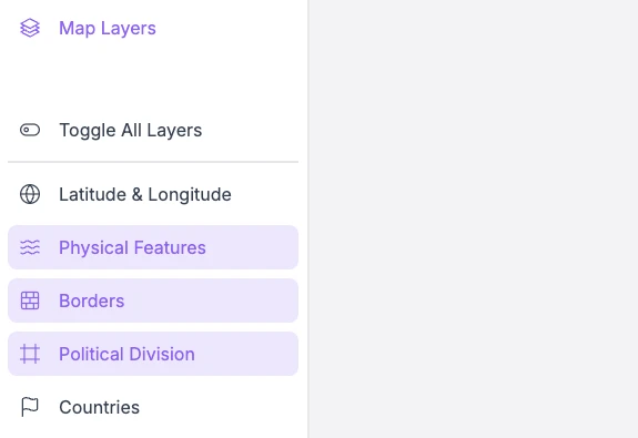
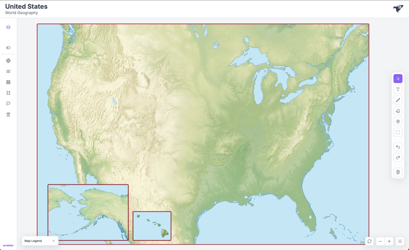
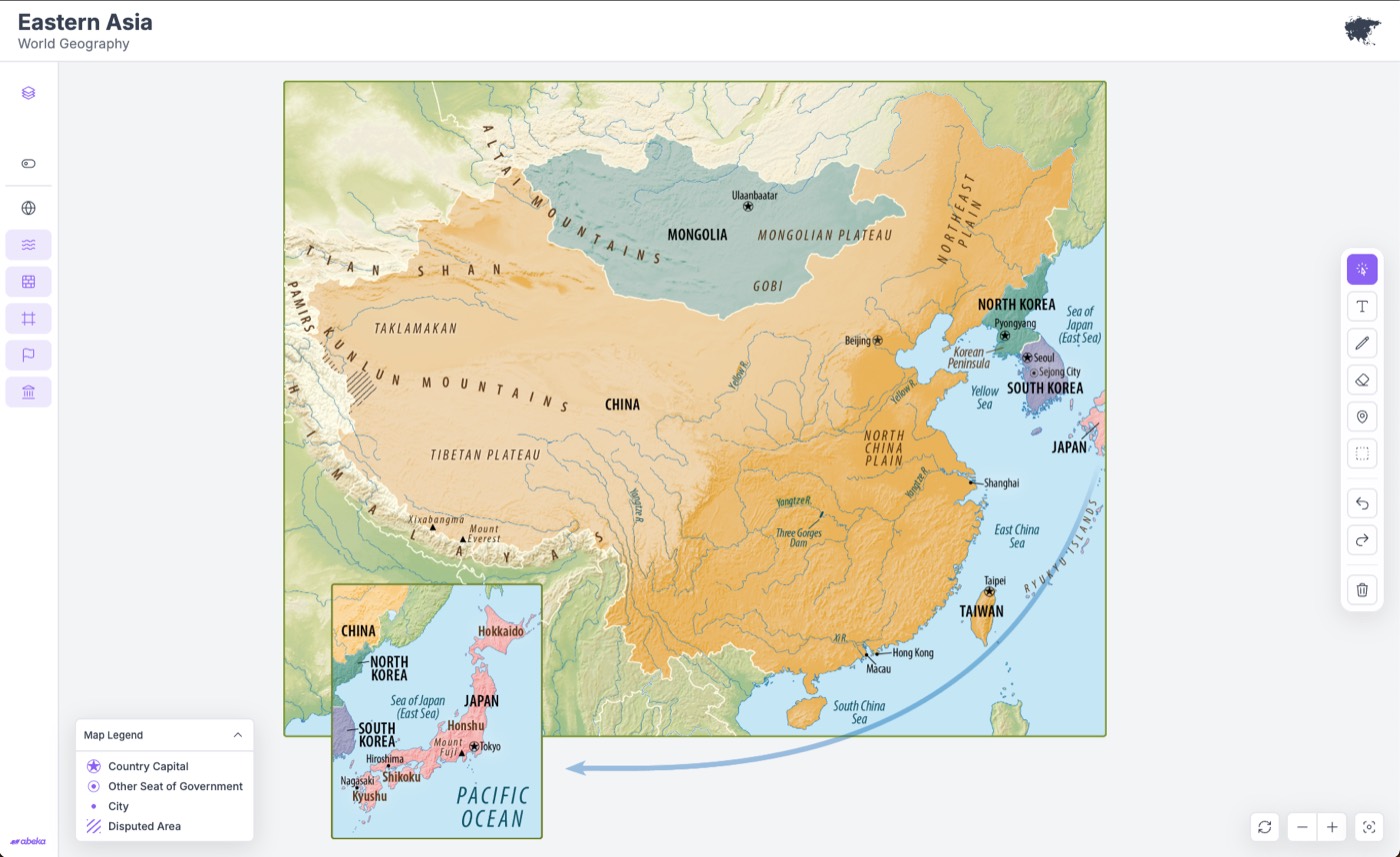
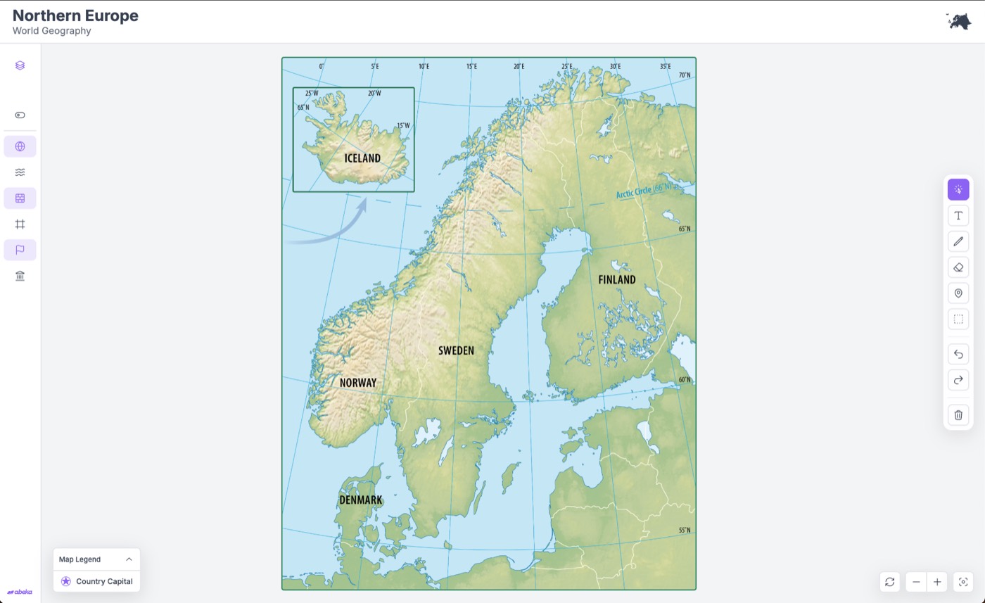
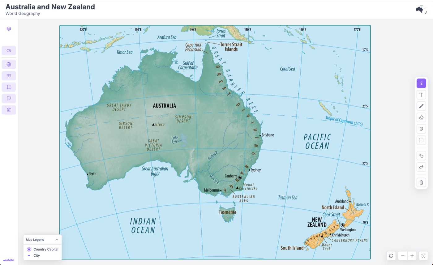
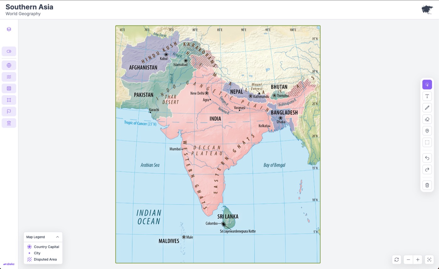
A layered map system built around the exact maps used throughout the curriculum.
Why?
Lessons required mixing political, physical, and border information on one map, then revealing capitals or latitude lines only when the activity called for them. Layers made that possible on the same image teachers already used in books and lectures, so students never had to relearn the geography of a page they already knew.
Outcome
A simpler system that supported classroom instruction, with the same visual language across every learning environment.
Constraints
The original vision had to survive the same gates any product here has to survive: it had to work offline, match the textbook, and still be maintainable when the curriculum changed. User needs and business needs had to clear those gates together.
I ran the original vision through those gates. Layered maps were what survived.
Technical
Abeka products must:
- 01Work offline
- 02Run across all supported devices
- 03Remain stable for long sessions
Content
The maps also needed to:
- 01Match the curriculum exactly
- 02Align with textbook content
- 03Support teacher lesson plans
Business
The team needed a solution that was:
- 01Maintainable
- 02Scalable
- 03Easy to update
What could pass every gate
Nothing yet.
Teacher Tools
After the year off, I came back asking what a teacher would want to do during class, not what the map should do.
Instead of asking:
What should the map do?
I asked:
What would a teacher want to do during class?
Annotation Toolkit
I borrowed the spirit of Figma and FigJam: a small, reusable set of tools you don't have to think about, aimed at a lesson instead of a design file.
Circle a river, trace a coastline, or sketch a route so the class can follow the lesson on the map itself.
User Testing
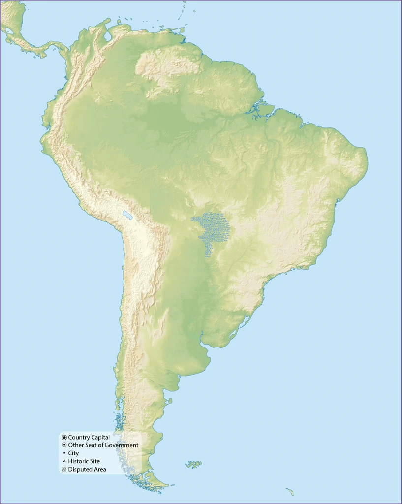
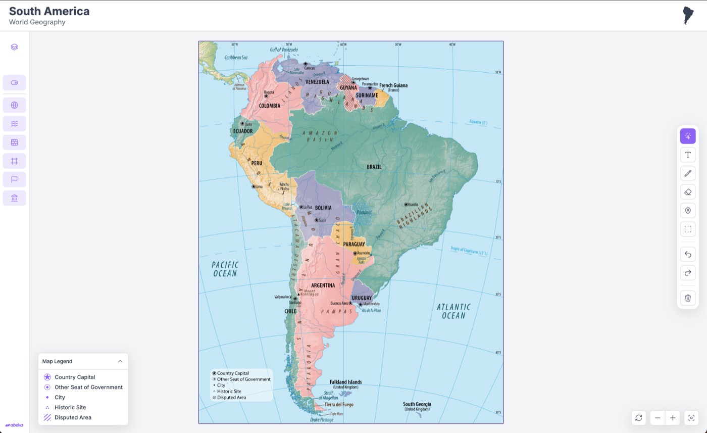
The first toolbar sat along the bottom and covered the exact coastline teachers needed. Moving it to the side was an unglamorous fix that made the map readable from the back of the room.
Outcome
The advanced tools stayed. They just stopped competing with South America.
Internal Tools
The classroom was only half the problem. Standing up a new interactive still meant exporting files, converting them, and waiting on a code pass — twenty minutes at a time. If the classroom system was going to scale with the curriculum, the internal workflow had to get simpler too.
Existing Workflow
Each map started in InDesign and crawled through export, conversion, hand-encoding, and code edits before anyone could even change a title.
Six steps
Additional Problem
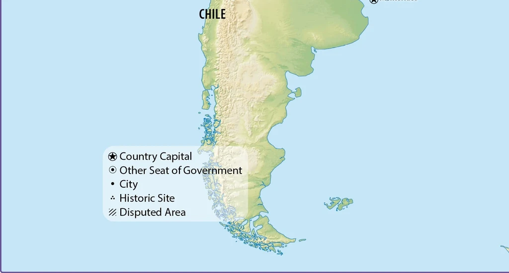
Legends were printed into the map image. Zoom in and they fell apart. Change a symbol and you redesigned the file. Every revision paid that tax again.
Solution #1
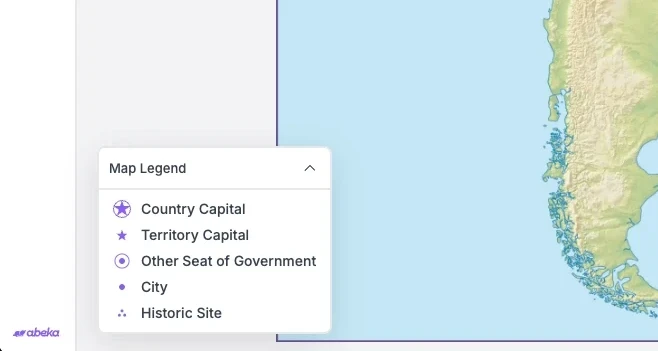
Dynamic Map Legend
I pulled the legend out of the artwork and into the interface: a panel that sits on the map, stays sharp when you zoom, and updates without a new export. The legend became a component the interface could update.
Outcome
Reduced map production time from:
3 days → 1.5 Days
Solution #2
Interactive Builder
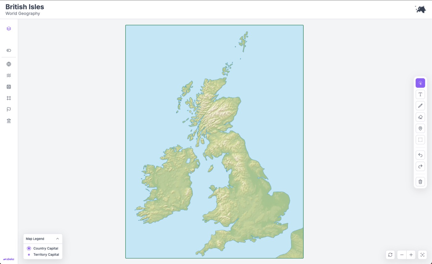
Then I built a map builder so content teams could upload layers, rename them, add or remove one, set the legend, and update titles without waiting on engineering. The classroom product and the builder share the same layer model, so a new region is a new set of files, not a new interface.
Outcome
Reduced setup time from:
10 Minutes → 1 Minute
Validation
Teachers sat with prototypes throughout. They didn't hedge. The feedback went straight back into the next pass, which is how a side toolbar replaced a bottom one that had been covering the coastline.
From the classroom
One of them said it out loud:
“This is everything we've ever wanted.”
Key Findings
Finding 1
Teachers chose flexibility over extra features every time we tested.
Finding 2
Once they had a pen and a pin, those tools weren't extras. They were the lesson.
Finding 3
Layer combinations covered activities that used to require four paper maps.
Impact
Teacher Impact
They can stack the maps the lesson needs, mark them while they talk, and invent an activity on the fly instead of hoping the printed set matches the plan.
Organizational Impact
Map files used to take three days because legends and labels lived in the artwork.
3 days → 1.5 Days
Standing up a new interactive went from a ten-minute code pass to a minute in the builder.
10 Minutes → 1 Minute
Product Impact
The same layered system can take the next region's maps without rebuilding the product.
Reflection
What I Learned
I spent a long time assuming a better geography product meant more technology: a globe, live data, interactions that felt expensive. Talking to teachers was the correction. Constraints were not the thing in the way of the vision. They were how I knew which vision was real.
They needed to rearrange what they already taught, not replace it. Build for the period, not the demo, and you get something that is easier to ship, easier to stand in front of, and actually used. The same rule holds for any system that has to last longer than a prototype: a small set of tools other people can keep using, instead of a one-off that only works in the demo.